

By Yael Mark
In the modern digital landscape, the dashboard has evolved from a simple administrative tool into the heartbeat of the user experience. Whether it is a high-intensity fitness tracker, a complex project management suite, or an intuitive online learning platform, the dashboard is the primary interface through which users monitor their progress. Yet, a common pitfall plagues many software developers: treating the dashboard as a passive display case for raw data rather than a psychological catalyst for action.
To move the needle on user engagement, designers must shift their focus from mere information visualization to the principles of behavioral science. A truly effective dashboard does not just show a user where they are; it compels them to take the next step.
The Core Objective: Aligning Data with User Intent
Before a single pixel is placed, product teams must confront the "Why." Users do not log into platforms to admire charts or admire the aesthetics of a UI. They are there to solve a problem, reach a milestone, or cultivate a habit. Whether the user’s goal is to lose weight, improve professional efficiency, or master a new language, the dashboard serves as the bridge between current state and desired outcome.

Understanding the Motivational Drivers
At the intersection of design and psychology lie two primary forms of motivation: extrinsic and intrinsic.
- Extrinsic Motivation: This is driven by external rewards or pressures—badges, leaderboard rankings, or the desire to avoid penalties. It is highly effective for short-term engagement and habit formation.
- Intrinsic Motivation: This is internal. It is fueled by the inherent enjoyment, curiosity, or personal value an activity holds for the user. It is the gold standard for long-term retention.
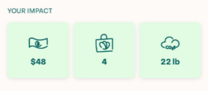
The most sophisticated products, such as the food-waste reduction app Too Good to Go, masterfully weave both. By presenting users with "money saved" (an extrinsic reward) alongside "CO2 emissions avoided" (an intrinsic alignment with the user’s environmental values), the app creates a dual-layered feedback loop that satisfies the wallet while fulfilling the user’s moral compass.
The Power of Perception: Strategic Framing
Behavioral science teaches us that the "Framing Effect" is one of the most potent tools in a designer’s arsenal. How data is presented often dictates the user’s emotional reaction to it. A simple change in terminology can shift a user’s perception from "task-oriented labor" to "purpose-driven progress."
Case Studies in Cognitive Framing
Consider the mindfulness app Calm. A standard, utilitarian design might display "Total Minutes Spent in App." While accurate, this is cold and emphasizes the tool rather than the goal. By rebranding this metric as "Mindful Hours," Calm aligns the data directly with the user’s intent to find tranquility. The framing transforms a time-tracking metric into a testament to personal growth.
Similarly, Grammarly utilizes "Social Comparison Theory," a concept pioneered by Leon Festinger in 1954. By showing users how their writing performance stacks up against others in a percentile, Grammarly taps into the innate human desire for self-evaluation and status. Even when a user’s score is not perfect, the framing provides a clear benchmark for improvement, converting potential frustration into a constructive challenge.
The "Newbie" Trap: Preventing Early Attrition
A critical, yet frequently overlooked, phase of the user journey is the onboarding experience. When a new user logs into a dashboard and is greeted by "0" values, empty progress bars, or blank graphs, the psychological impact is immediate and negative. This "empty state" signals a lack of progress, which can lead to rapid churn.
Designing for Momentum
To combat this, successful platforms engineer "quick wins" into the very first session.
- Duolingo’s onboarding is a masterclass in this approach. By requiring a mini-lesson during setup, the user lands on their dashboard with an immediate "streak" or completed badge. They are never greeted by a void; they start with momentum.
- Substack employs a subtle, clever nudge: when a new creator sets up a newsletter, the platform automatically subscribes the creator to their own publication. By ensuring the dashboard shows at least one subscriber, the platform mitigates the "blank page" anxiety and encourages the user to begin their journey with a sense of existing progress.
Implications for Product Strategy
The transition from "data display" to "behavioral engine" has profound implications for product development. It requires a shift in how we define success metrics. If a dashboard is designed solely for clarity, we miss an opportunity to drive engagement. If it is designed for engagement, we must be careful not to sacrifice clarity or user trust.

Strategic Recommendations:
- Audit the "Why": Conduct user research to map features directly to core goals. If a widget on your dashboard does not contribute to a user’s primary objective, consider removing it to reduce cognitive load.
- Mix Your Incentives: Evaluate your dashboard’s metrics. Do you have a balance of extrinsic rewards (streaks, points, status) and intrinsic reflections (progress, contribution, personal mastery)?
- Humanize the Copy: Review your labels. Replace generic terms like "Data" or "History" with action-oriented language that reflects the user’s specific journey.
- Eliminate the "Zero": Audit your onboarding experience. Ensure that no user—no matter how new—faces a dashboard that feels barren or stagnant.
Conclusion: Designing for the Human Experience
The future of software is not in the proliferation of more complex data, but in the intelligent presentation of meaningful information. By grounding our design choices in the immutable laws of human psychology, we can build platforms that don’t just occupy space on a screen, but actively support the user’s aspirations.
Whether it is through the strategic use of social comparison, the careful framing of progress, or the thoughtful management of the first-time experience, the goal remains the same: to create a digital environment where the user feels empowered, motivated, and understood. In the final analysis, the most successful dashboards are those that disappear into the background, leaving the user with a clear view of their own progress and a renewed sense of purpose.
Yael Mark is a seasoned product manager and specialist in behavioral economics. Her work focuses on implementing behavioral theories to optimize user retention, digital stickiness, and long-term engagement. This article was edited by Carina Müller.