

By Yael Mark
In the modern digital landscape, the dashboard has evolved from a simple data-visualization tool into the primary interface through which users interact with value. From fitness trackers and project management suites to sophisticated EdTech platforms, dashboards serve as the command centers for our professional and personal lives. However, a common pitfall plagues many product teams: the assumption that raw data transparency equals user engagement.
Experience proves that the most effective dashboards do not merely display information; they catalyze action. To build a system that users return to consistently, designers and product managers must look beyond pixel-perfect aesthetics and delve into the architecture of human psychology. By integrating principles from behavioral science, we can transform static screens into dynamic engines of motivation.
The Core Objective: Aligning Design with Human Goals
Before a single line of code is written or a chart is plotted, product teams must confront the fundamental question: What is the user’s ultimate objective?
Users do not log into your platform to admire your data visualization; they log in to solve a problem, reach a milestone, or change a behavior. Whether they aim to improve their cardiovascular health, master a new language, or organize a complex workflow, your dashboard is merely a vehicle for that journey.
To build an effective dashboard, you must map your features to the user’s "Why." This process begins by segmenting motivation into its two primary drivers: Extrinsic and Intrinsic motivation.
Extrinsic vs. Intrinsic Motivation
Extrinsic motivation is fueled by external incentives—rewards, status, or the avoidance of negative consequences. Think of a student grinding through a textbook to secure an ‘A’ grade or a worker finishing a report to avoid a missed deadline. These are powerful, short-term drivers.

Conversely, intrinsic motivation originates from within. It is the drive to engage in an activity because it is inherently satisfying, interesting, or aligned with a personal identity. When a student studies because they are fascinated by the subject, or a runner hits the pavement because they love the feeling of wind on their face, they are intrinsically motivated.
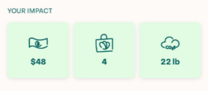
The most successful platforms, such as Too Good to Go, master the art of the hybrid approach. By displaying both the "money saved" (an extrinsic, tangible reward) and "CO2 emissions avoided" (an intrinsic, value-driven reward), they reinforce the user’s decision to continue using the service through multiple psychological channels.
The Power of Framing: How Presentation Shapes Perception
In behavioral science, the Framing Effect posits that the context in which information is presented determines how it is interpreted. A message is rarely neutral; its impact is often defined by the vocabulary and logic applied to it.
Redefining Metrics
Consider the mindfulness app Calm. A standard, unimaginative dashboard might display a metric labeled "Time Spent on App." While accurate, this is sterile. Calm rebrands this data as "Mindful Hours." This simple shift in framing transforms a raw usage metric into a testament to the user’s personal progress toward peace and focus. By aligning the data label with the user’s emotional goal, the dashboard validates their journey rather than just reporting on their activity.
The Role of Social Comparison
Humans are inherently social, and we often define our success through the lens of those around us. This is the foundation of Social Comparison Theory, a concept famously introduced by Leon Festinger in 1954.
Grammarly leverages this effectively by providing users with a percentile rank for their writing. Even if a user is not yet a "master" writer, seeing their performance relative to others provides a powerful, measurable goal. It satisfies the human urge for positive self-evaluation and provides a concrete path for improvement. When implemented carefully, these comparisons can transform a potentially discouraging piece of negative feedback (e.g., "you made errors") into a motivating challenge (e.g., "you are in the top 30% of users").
The "Cold Start" Problem: Designing for Newcomers
A fatal flaw in many dashboard designs is the "Empty State." When a new user logs in, they are often greeted by a screen full of zeros or placeholders. For a user who has just begun their journey, this can be profoundly demotivating. It reinforces a sense of failure before the user has even had the chance to succeed.
Engineering the "Quick Win"
To combat this, successful platforms engineer immediate, frictionless wins for new users.
- Duolingo mandates that users complete a lesson during the initial onboarding phase. By the time they reach their dashboard, they aren’t looking at a blank page; they are looking at a "Streak," a piece of progress that they have already earned.
- Substack addresses the "zero-subscriber" anxiety by automatically subscribing creators to their own publication. By ensuring the dashboard never shows a lonely "0," they preserve the user’s morale, allowing them to focus on content creation rather than metrics anxiety.
By integrating these "quick wins" into the onboarding flow, companies can build the momentum required for long-term retention.
Chronology of Behavioral Integration
The implementation of these strategies follows a logical, iterative progression:
- Discovery (The Why): Identifying the core user goal through research.
- Mapping (The What): Selecting metrics that satisfy both extrinsic (reward) and intrinsic (value) motivations.
- Refinement (The How): Applying framing and social comparison to make data digestible and aspirational.
- Onboarding (The Start): Eliminating empty states to ensure the first impression is one of progress.
Implications for Future Product Development
The implications for this psychological approach to design are profound. As AI and big data continue to provide us with an overwhelming volume of information, the value of a platform will increasingly depend on its ability to filter, frame, and present that data in a way that is human-centric.
Future dashboard development must move toward "behavioral intelligence." This means moving beyond the "one-size-fits-all" layout. We are entering an era where dashboards should dynamically adapt to the user’s current psychological state and progression level. A power user may need density and complex filtering, but a novice needs guidance, positive reinforcement, and a sense of movement.
Official Perspectives and Industry Trends
Industry leaders have begun to recognize that "Engagement" is not just a marketing metric—it is a design responsibility. Ethical product design suggests that we should not be engineering "addictive" loops that exploit human vulnerabilities, but rather "supportive" loops that help users stay true to their stated intentions.
By aligning features with the user’s authentic goals, we create a sense of agency. When a user feels that their dashboard is a partner in their success rather than a judge of their output, they are significantly more likely to maintain a long-term, healthy relationship with the product.

Closing Thoughts: Designing for Action
The art of the dashboard is the art of motivation. To build a product that stands out, we must stop viewing dashboards as static reporting tools. Instead, we should see them as behavioral interventions.
Whether it is through the careful selection of widgets, the intentional use of microcopy, or the strategic elimination of demotivating "zero" states, every element on your screen should contribute to the user’s sense of purpose. When you successfully align your dashboard with your user’s intrinsic values and extrinsic needs, you do more than just inform them. You inspire them to take the next step.
The data is only the beginning. The behavior you drive is the true measure of your success.
Yael Mark is a seasoned product manager with a passion for behavioral science. Her work focuses on implementing behavioral theories to affect user response, product stickiness, and sustainable engagement.
