

By Yael Mark
In the modern digital landscape, the dashboard has evolved from a simple data-visualization tool into the primary touchpoint for user experience. Whether it is a fitness tracker, a project management suite, or an e-learning application, dashboards serve as the command centers where users interact with their progress. Yet, a common pitfall persists among product designers: the belief that a dashboard’s value lies solely in the accuracy and breadth of the data it displays.
In reality, the most successful platforms—those that boast high retention rates and consistent user activity—do not just inform; they motivate. By leveraging the principles of behavioral science and psychology, designers can transform static charts into dynamic engines of engagement. Building a dashboard that works requires moving beyond mere aesthetics to understand the underlying psychological architecture of the user journey.
The Core Objective: Aligning Design with User Psychology
Before a single pixel is placed, designers must perform a foundational audit of user intent. Why is the user here? What specific problem are they trying to solve, and what is the "job" they are hiring the product to perform? A user does not log into a weight-loss app to see numbers; they log in to lose weight. They do not open a project management tool to track hours; they open it to ensure a project remains on schedule.
Your product is not the goal; it is the vehicle. To design for engagement, you must identify whether you are fueling the user’s extrinsic or intrinsic motivations.

Extrinsic vs. Intrinsic Motivation
- Extrinsic Motivation involves external rewards or the avoidance of negative outcomes. Examples include badges, streaks, leaderboard rankings, or the financial incentive of "saving money."
- Intrinsic Motivation originates from within. It is driven by the enjoyment of the task, a sense of mastery, or the fulfillment of a personal value system.
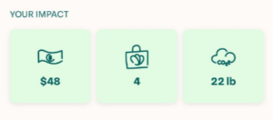
The most potent dashboards blend both. Consider Too Good to Go, an app dedicated to reducing food waste. Its dashboard features a dual-metric system: it displays the total money saved (extrinsic, providing immediate gratification) alongside the total CO2 emissions avoided (intrinsic, appealing to the user’s environmental values). By catering to both, the app creates a multifaceted reward system that keeps users returning.
The Power of Framing: How Context Changes Perception
The "Framing Effect" is a cornerstone of behavioral economics, stating that the context in which information is presented determines how it is processed and acted upon. In dashboard design, the language used to describe data can be the difference between a user feeling overwhelmed or feeling empowered.
Redefining Metrics
The meditation app Calm provides a masterclass in this. Rather than using the clinical and potentially guilt-inducing label "Time Spent on App," they utilize the phrase "Mindful Hours." This simple linguistic shift recontextualizes the data. It is no longer about screen time—a metric often associated with addiction—but about the user’s primary goal: achieving mindfulness.
Leveraging Social Comparison
Human beings are inherently social creatures, and we constantly evaluate our own success by measuring it against our peers. This is known as Social Comparison Theory, first articulated by Leon Festinger in 1954.
Grammarly effectively utilizes this principle by providing users with a writing percentile. By showing users how their performance compares to the broader user base, Grammarly taps into the human urge for positive self-evaluation. Even when a user’s score is lower than they would like, the framing provides a clear benchmark and a competitive nudge to improve, transforming a critique of one’s writing into a catalyst for growth.
Supporting the "Newbie": Solving the Empty State Problem
A significant design failure occurs when teams build dashboards optimized for power users while ignoring the "newbie" experience. When a new user logs in for the first time and is greeted by a dashboard full of zeros or "No Data Available" messages, it creates a "cold start" problem. This void is demotivating and can lead to immediate churn.
The Anatomy of a "Quick Win"
To retain new users, designers must facilitate an immediate sense of accomplishment. This is often achieved through:
- Guided Onboarding: Duolingo excels here by requiring a lesson during the initial setup. By the time the user reaches their dashboard, they have already secured a "learning streak." The dashboard is not empty; it is a testament to progress already made.
- Mitigating the "Zero" Effect: Substack uses a clever psychological hack by automatically subscribing new creators to their own newsletters. By ensuring the dashboard shows at least one subscriber, the platform prevents the psychological sting of "zero," which can feel like a failure to launch.
Chronology of Behavioral Integration in Product Design
- 1954: Leon Festinger introduces Social Comparison Theory, providing the academic foundation for modern gamification and benchmarking features.
- 2010s: The rise of the "Quantified Self" movement pushes fitness trackers and productivity apps to the mainstream, establishing the dashboard as the standard UI element.
- 2020-2022: A shift occurs in the UX industry toward "Behavioral Product Management," where the focus moves from pure feature-shipping to designing for habit formation and long-term retention.
- 2024: Advanced AI-driven dashboards begin to offer personalized insights, moving from static charts to predictive, goal-oriented interfaces that lean heavily on behavioral nudges.
Implications for Future Product Development
The implications for product managers and UX designers are clear: data visualization is no longer a neutral activity. Every chart, widget, and notification is a psychological intervention. As we move toward more automated and AI-integrated platforms, the responsibility to use these psychological levers ethically grows.
The goal is not to manipulate, but to align the product’s feedback loop with the user’s genuine aspirations. When a dashboard is designed with these behavioral principles, it becomes a partner in the user’s success.
Summary of Best Practices:
- Audit for Motivation: Does your dashboard highlight both extrinsic wins and intrinsic milestones?
- Frame for Meaning: Replace clinical labels with goal-oriented language that reinforces the user’s "Why."
- Benchmark Socially: Use comparison metrics to provide context for performance.
- Design for the First Minute: Never show a "blank" dashboard to a new user; prioritize a "quick win" that establishes a sense of progress immediately.
By shifting our focus from "what the user needs to know" to "how the user needs to feel to succeed," we can create digital environments that foster deeper, more meaningful engagement. A well-designed dashboard is not just a screen of data; it is the nudge that helps a user become the person they aspire to be.

This article was edited by Carina Müller.
About the Author:
Yael Mark is a seasoned product manager with a passion for behavioral economics and science. In her work, Yael focuses on implementing applicable behavioral theories to affect user responses, product stickiness, and long-term engagement.
