
 By Lina Hope
By Yael Mark
In the modern digital landscape, the dashboard has evolved from a simple administrative necessity into the heartbeat of the user experience. Whether it is a high-stakes project management suite, a personal fitness tracker, or an AI-driven learning platform, dashboards serve as the primary interface through which users interact with their own progress. However, as product managers and UX designers have discovered, displaying data is not the same as driving engagement.
A dashboard that merely reports information is passive. A dashboard that succeeds is an active participant in the user’s journey, designed not just to inform, but to motivate. To move beyond mere utility, designers must look toward the principles of behavioral science. By synthesizing cognitive psychology with interface design, creators can transform static metrics into powerful catalysts for user retention and habit formation.
The Psychology of Purpose: Aligning Design with User Objectives
Before a single pixel is placed, the product team must address a fundamental question: Why is the user here? No one logs into a platform for the sheer joy of data entry or metric viewing. They are there to solve a problem or achieve a milestone.
The Dual Engine of Motivation
Motivation is the fuel for long-term engagement, and behavioral science categorizes this fuel into two distinct types: Extrinsic and Intrinsic.

- Extrinsic Motivation: This is driven by external incentives—rewards, badges, leaderboard rankings, or the avoidance of negative consequences. It is an effective way to trigger initial actions and sustain momentum through gamification.
- Intrinsic Motivation: This arises from within. It is fueled by curiosity, personal mastery, and the inherent satisfaction of growth.
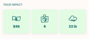
The most effective dashboards act as a bridge between these two. Consider the app Too Good to Go, which tackles food waste. The platform provides a perfect case study in balanced motivation: it shows the user the exact amount of money they have saved (extrinsic) while simultaneously displaying the kilograms of CO2 emissions prevented (intrinsic). By acknowledging both the financial benefit and the moral contribution, the app creates a dual-layered reward system that reinforces the user’s decision to remain on the platform.
The Art of Framing: Perception is Reality
The Framing Effect is a cornerstone of behavioral economics, stating that the way information is presented dictates how it is perceived and acted upon. In product design, changing a label is not just a semantic choice—it is a psychological lever.
Reframing for Impact
Take, for instance, the mindfulness application Calm. A standard dashboard might track "Time Spent on App." However, "time spent" can sound like a chore or an obligation. By relabeling this metric as "Mindful Hours," Calm aligns the data directly with the user’s ultimate goal: achieving mental clarity. This simple shift in framing turns a duration metric into a progress indicator, shifting the user’s focus from "how much work I’ve done" to "how much peace I’ve gained."
Social Comparison as a Motivator
Humans are inherently social, and we often define our success through the lens of those around us. This is the essence of Social Comparison Theory, first conceptualized by Leon Festinger in 1954.
Grammarly masterfully applies this to their writing assistant. When a user receives a performance score, they aren’t just given an arbitrary number. The platform shows the user their writing percentile relative to others. By providing this benchmark, Grammarly leverages the human desire for positive self-evaluation. Even if a user is currently underperforming, the social comparison provides a clear signal that improvement is possible and highlights the gap between their current state and the community standard.
The Onboarding Paradox: Protecting the Newcomer
A common pitfall in dashboard design is the "blank slate" problem. Designers often build for the power user, creating interfaces rich with historical data, trends, and complex charts. While this satisfies the veteran user, it can be devastating for the newcomer.
Avoiding the "Zero-Value" Trap
When a new user logs in and sees a dashboard populated with empty graphs or "zero" values, it triggers a sense of failure before they have even begun. This is a critical point of churn. To mitigate this, successful platforms implement strategies to ensure an immediate "Quick Win."
- The Duolingo Approach: Duolingo mandates a lesson during onboarding. By the time a user reaches their dashboard for the first time, they aren’t looking at a blank screen; they are looking at a "learning streak" that has already begun. They are not starting from scratch; they are building on a foundation.
- The Substack Strategy: Substack employs a clever psychological hack by automatically subscribing new creators to their own newsletters. It ensures that the first time a user views their dashboard, they see at least one subscriber. This small, simulated success prevents the feeling of isolation and encourages the user to begin their first post with confidence.
Chronology of Effective Dashboard Evolution
The trajectory of modern dashboard design has followed a distinct evolution:
- The Reporting Phase (2010–2015): Dashboards were simple data repositories. They focused on "what" happened (e.g., "You ran 5 miles").
- The Gamification Phase (2015–2019): Platforms began adding badges, levels, and simple extrinsic rewards to increase retention.
- The Behavioral Science Phase (2020–Present): The current era, where design is rooted in understanding the user’s cognitive biases, emotional needs, and long-term psychological goals. We are now asking "why" and "how" to move the user toward their desired outcome.
Implications for Future Product Development
The implications of these findings for product teams are clear: a dashboard is not a utility—it is a communication channel. If your goal is to increase user engagement, you must treat the interface as a psychological intervention.
Strategic Recommendations:
- Audit Your Metrics: Are your widgets measuring vanity, or are they measuring the user’s success? If the metric doesn’t align with the user’s "Why," it likely isn’t driving behavior.
- Audit Your Copy: Language matters. "Task Completion Rate" is a functional description; "Goal Progress" is a motivational one. Audit your microcopy to ensure it speaks to the user’s aspiration.
- Design for Day One: Assume your users are intimidated. Use onboarding to bridge the gap between their first login and their first victory.
- Inject Social Context: When appropriate, use social comparison to create a sense of belonging and progress, ensuring that users feel part of a larger, aspirational cohort.
Closing Thoughts: Beyond the Pixels
Designing a dashboard that effectively drives behavior requires a shift in mindset. It requires moving away from the role of a data reporter and into the role of a behavioral architect. By carefully aligning features with intrinsic and extrinsic motivations, leveraging the power of framing, and proactively supporting new users through their most vulnerable stage, you can create a platform that users do not just "use"—they rely on.

Ultimately, the best dashboards are those that disappear. They become such an integral part of the user’s journey that the user no longer feels they are interacting with a tool, but rather witnessing their own progress. When you achieve that level of alignment, you don’t just have a product—you have a partner in your user’s success.
Edited by Carina Müller.
 rifanmuazin
  Sagoh
Sagoh  Evan Lee Salim